How can I build a chart?
To start building charts, navigate to the Charts section and click “+ Chart” in the top right corner
1. Choose the right dataset

To create a chart you need a dataset that will be a foundation of the visualisation. Verify your dataset before creating any visualisation. Dataset can be already loaded or created and saved via SQL queries in the SQL Studio section.
2. Choose the desired chart type

As outlined in Which chart types are available? there are currently eight different types of charts available on Polyteia Analytics. Select the appropriate chart type and hit “Create new chart” in the bottom right corner.
3. Name your chart or edit chart source

After adding a name for the chart (make sure you are adhering to any naming conventions your administrators have provided) you can now control the Chart Source or underlying data set. You can edit, swap, and open it in SQL Studio.
4. Search available columns

Directly below the Chart Source panel is the Columns panel. Search Columns field enables you to quickly find the data you need.
Each data type includes a small icon that conveys its type:
- 🕔: Time column
- abc: Text data
- #: Numeric value data
- 1|0: Bolean
Columns can be dragged & dropped into the Data panel to configure your visualisation.
5. Configure your chart

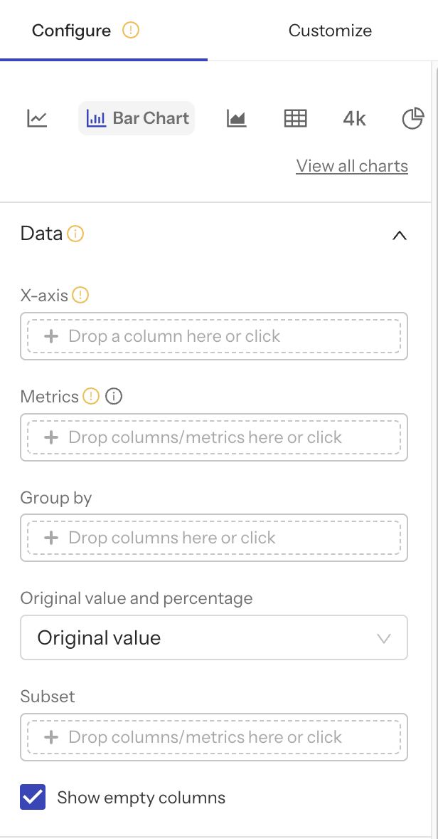
Depending on the data you wish to visualize, you have the flexibility to change the chart type used. You can seamlessly switch between common chart types without losing any previously configured fields, allowing you to discover the most suitable one for your specific needs.
Begin by selecting the dimension for the x-axis in the "Data" panel of the "Chart Editor." Polyteia Analytics accommodates both temporal (time series) and non-temporal x-axis dimensions. If you opt for a temporal dataset column as the x-axis dimension, a "Time Grain" field will emerge, asking you to determine the granularity of the x-axis values. For non-temporal dataset columns as the x-axis dimension, sorting options are available.
Next, drag columns to the relevant destination fields. Upon dropping the column, a pop-out window associated with the field will prompt you to enter details.
The Metrics field is designated for defining the quantitative measurements or calculations you aim to visualize and analyze. These metrics shed light on various facets of your data, helping you discern trends, patterns, and performance indicators across diverse dimensions and time periods.
Group by enables you to categorize and segment your data, facilitating the analysis of specific subsets. Grouping data by dimensions such as time, region, or product category allows for targeted assessment and comparative analysis.
In the Original Value or Percentage field, you can decide whether the chart should display the absolute values within your visualization or represent each component's contribution as a percentage of the total value. Both approaches provide insights, with Original Value offering raw numbers and percentage illustrating relative proportions.
The Subset option permits you to refine your data's focus before generating visualizations. This feature enables you to define specific subsets based on criteria like region, date range, or product category.
The "Annotations and Layers" feature, while still in development, will empower users to augment their visualizations with additional context or information directly on the chart.
Annotations generally include text labels, arrows, or shapes to underscore particular data points, trends, or occurrences within the visualization. These annotations can significantly enhance communication of insights or emphasize principal data.
Layers, conversely, allow for the addition of multiple visual elements to the chart, such as extra charts, images, or bespoke graphics. They offer a method to amalgamate various types of visualizations or incorporate external content within the chart, enriching its complexity and detail.
In essence, annotations and layers provide the versatility to incorporate supplementary information or visual components to charts, rendering them more informative and visually compelling.
6. Customize Your Chart

To personalize the appearance of your chart, navigate to the Customize tab. Polyteia Analytics presents an extensive array of customization options. The fields in the tabs “Customize” and “Configure” will differ based on the chosen chart type, each with unique functionalities. Explore various chart types and experiment with the diverse settings to discover their capabilities.